As I did in 2016 (and unfortunately forgot to do in 2020), I’m grouping the presidential campaign logos both good and bad. Not only do I love politics, but I love the branding and marketing elements of politics as well. So, since the presidential cycle seems to be leveled out as far as candidates in the race, let’s have a look at these logos.
THE BAD

You probably haven’t heard of this candidate. Ryan Binkley is a businessman in Texas as well as a pastor and church planter. He has no shot of making it to a debate stage, let alone securing the nomination. My criticism with his logo is the detail in the lettering. The more details involved, the more time a person has to spend figuring out what a logo says. However, the bottom of the Y serving as the dot on the “i” is cute. The slogan, star, and “2024” at the bottom are also unnecessary. I would have taken out the slogan, star, and “2024” and replaced the large star at the top with a ’24 next to Binkley’s first name.
I like Tim Scott. Always have. I especially love his optimistic outlook on the American future. However, there is no creativity in this logo. In fact, it looks like he took Cory Booker’s logo from 2020 and just retyped his name. I’ve also been told that when all-caps are used, the brain is comprehending symbols rather than words. The letters are bold, which is nice, and the slogan on the bottom isn’t terrible. But if you truly believe in your logo and you’ll use it often (which he does), make it a more prominent part of your branding.
I don’t hate this logo as much as you think. I love the bright, Republican red. Not a fan of the overly detailed letters as I mentioned earlier. But I can’t stand logos with forced excitement. The exclamation point is the “please clap” of the logo. I also can’t get over the long white gap between the capital A and the field of stars (?). Additionally, take a look at this logo from a Democratic candidate in 2020. Notice any…similarities?
THE GOOD
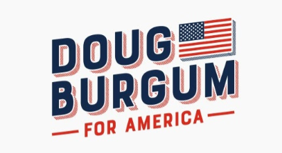
Campaign logos that hearken to yesteryear are always a favorite of mine. This one gives me “Greetings from sunny California!” vibes with the flag serving as the stamp. Except Doug Burgum governs one of the coldest states in the Union! The shadow effect is a lovely contrast to the navy letters that aren’t overly detailed. I’d vote for this guy simply because his logo rocks!

Whoever Ron DeSantis hired for this should be retained. This is a logo that isn’t too detailed and isn’t lacking. The curvature of DeSantis’s name is a non-threatening trick on the eyes. I like college block font and think it works well with his name. The spacing of the letters on the bottom line of text are perfect and signify boldness in the candidate. I’m not as big a fan of the flag on top, but it’s nothing I can’t get over. I’m honestly just glad he stopped ripping off of Trump’s logo when he was running for re-election in Florida. I know imitation is the highest form of flattery, but at some point, it just becomes idolatry.

Nothing like a good navy logo! I prefer navy in logos anyway because the white lettering pops a little better. Nikki Haley channeled Carly Fiorina for this logo and did well. Name and office seeking. That’s really all you need in a logo. The color contrast in her name sans the space works well, though I’m not sure what’s going on with the A. The bottom line of text is bold, but not loud. This is a well-balanced logo.
